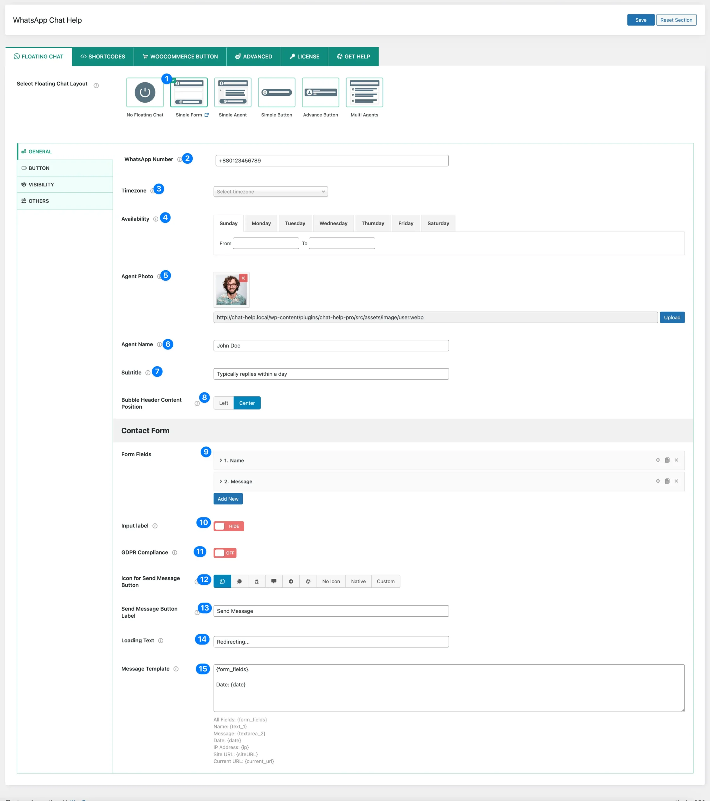
Single Form Layout: This layout offers a structured interface for users to start a WhatsApp chat with an agent. It includes input fields, an agent’s profile display, and customizable settings to enhance user experience.
WhatsApp Number: Specify the WhatsApp number to which messages will be sent.
TimeZone: Choose the appropriate timezone to ensure accurate scheduling and availability.
Availability: Set the available days and time slots when the agent will be online.
Agent Photo: Upload an image to personalize the chat experience.
Agent Name: Display the agent’s name for a personalized interaction.
Subtitle: Provide a short description (e.g., “Typically replies within a day”).
Bubble Header Content Position: Adjust the positioning of the chat header content.
Form Fields: Create unlimited fields for visitors to fill out. Detailed information about this option is available here.
Input Label: Choose to show or hide input labels on the frontend.
GDPR Compliance: Enable GDPR compliance settings if required.
Icon for Send Message Button: Select from a list of default icons, use a native icon, or upload a custom icon (PNG, JPG, SVG) for the send message button.
Send Message Button Label: Customize the text displayed on the send message button (e.g., “Send a message”).
Loading Text: Set a message to display while users are being redirected to WhatsApp with their pre-filled form data.
Message Template: Use dynamic placeholders to personalize messages before sending. Available placeholders include:
{form_fields}: Automatically inserts all data entered in the form fields.
Alternatively, insert specific form field data or use other dynamic variables as needed. All available placeholders and dynamic variables will be displayed for easy selection.
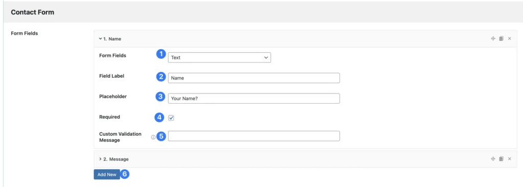
Form Fields
Field Type: Choose the type of field you want to use, such as text, textarea, phone, select, and more.
Field Label: Provide a label to identify the field, which can also be displayed on the frontend.
Placeholder: Enter the placeholder text to be shown inside the input field.
Required: Select the options you want to mark as required.
Custom Validation Message: Specify a custom message to display for form validation errors.
Add New Button: Click to add more fields to the form.