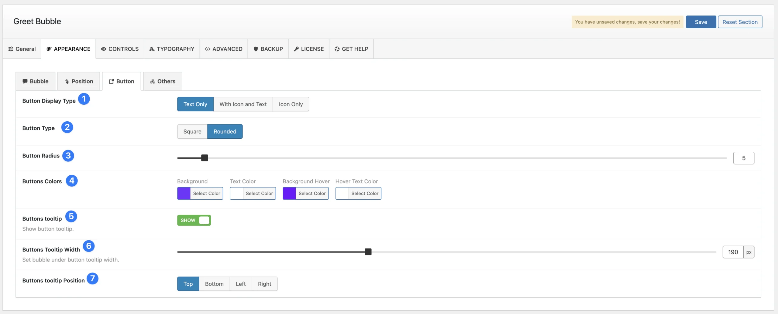
Button Customization Panel
This panel allows you to customize the appearance and behavior of buttons within the bubble.
(1) Button Display Type: Choose how the button appears:
- Text Only
- Icon and Text
- Icon Only
(2) Button Shape: Select between Square or Rounded button styles.
(3) Button Radius: Adjust the button’s border radius to control its roundness.
(4) Button Colors: Customize button colors, including:
- Background Color
- Text Color
- Hover Background Color
- Hover Text Color
(5) Button Tooltip: Enable or disable tooltips for buttons. When enabled, the button text will appear as a tooltip.
(6) Button Tooltip Width: Set a custom width (in pixels) for the tooltip.
(7) Button Tooltip Position: Choose the tooltip’s position relative to the button. Available options: Top, Bottom, Left, Right.