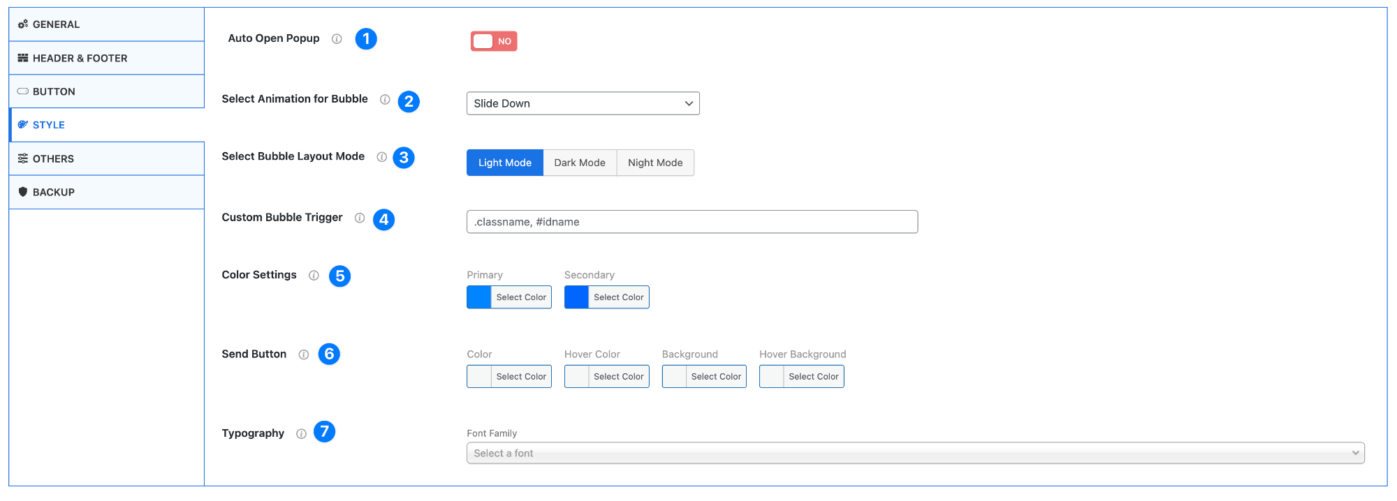
- Auto Open Popup – Enable or disable automatic opening of the chat popup.
- Yes – Chat opens automatically when the page loads
- No – User must click the button to open
- Select Animation for Bubble – Choose the animation effect for the chat popup.
Example: Slide Down
This controls how the chat appears on screen.
- Select Bubble Layout Mode – Choose the visual theme of the chat box.
- Light Mode – Bright and clean design
- Dark Mode – Dark background for low-light environments
- Night Mode – Even darker UI for night usage
- Custom Bubble Trigger – Set a custom trigger using CSS selectors.
Example:.classname,#idname
Use this if you want to open the chat from a custom button or element.
- Color Settings – Customize the main theme colors.
- Primary Color – Main color of the chat interface
- Secondary Color – Supporting accent color
- Send Button – Customize the send button appearance.
- Text/Icon color
- Hover color
- Background color
- Hover background
- Typography – Choose the font for the chat interface.
- Select a font family that matches your website style
Pro Tip
Match your chat colors and typography with your website branding to create a seamless user experience and stronger visual consistency.